Shadcn/ui without the React
What makes shadcn/ui looks so good?
Published on: Sat Apr 12 2025
Introduction
Since I have been exploring other ways to create web applications (ok mostly htmx), I have been forced to find an alternative to the beloved shadcn/ui library. It is a collection of modified Radix components, with amazing visual defaults. Another radical change here is that you copy-paste the components into your components and do not import them from a npm package, as you do with pretty much all other UI libraries & frameworks.
I have been using DaisyUI in sideprojects for years and have picked it up again for my current projects, where I am intentionally not choosing React. However, I do have to admit, that the interfaces, that I have been vibe coding with DaisyUI do not have the same feel as the shadcn/ui ones. There is something about shadcn/ui, where everything I build just looks and feels great. Especially since I was not gifted with an eye for design, it has been a real bliss to use.
Since I would like to have the best of both worlds, I will explore ways to achieve shadcn/ui-level interfaces with pure CSS.
And since I cannot put my finger on it, why I am not getting the same satisfaction with DaisyUI, at least just thinking about it, I thought I would make a side-to-side comparison of the same interface and then try to approximate the shadcn/ui one by modifying the DaisyUI theme. I hope that this work will shine more light on what makes the shadcn/ui design so special and will be useful, even if you are not using DaisyUI yourself.
The Plan
- Create a page to put components from both libraries side-by-side
- Modify the DaisyUI theme to match shadcn/ui
- Identify patterns and compile insights, so that at the end of this post the reader does not feel like I wasted their time
Keep in mind, that I will only compile a relatively small set of components. There are some fundamental differences in interactivity, composition and css variable usage in both libraries, that makes a “modify this global theme and done” approach not feasable (at least as far as I can tell, but could be a skill issue).
You can checkout the code and finished comparison here: https://github.com/daniellionel01/daisyui-shadcn
If you just want the daisy ui css, you can copy paste it here: https://github.com/daniellionel01/daisyui-shadcn/blob/main/src/styles/daisy.css
Side by Side
Here is the techstack, that we are going to use:
In terms of theme, we will start with the default theme for both libraries and then incrementally make adjustments to DaisyUI.
Luckily the range of components that both libraries offer are quite similar. You have the basics, such as buttons, cards, list items, navigation, input fields, alerts. And then some more niche components such as calendar, OTP, resizable, etc. Most of the more niche components are also composites of the basic components, so I do not think that there are going to be issues with a lack of components on either side.
You can checkout the results yourself here:
- Shadcn Components: https://daisyui-shadcn.vercel.app/components/shadcn
- DaisyUI Components: https://daisyui-shadcn.vercel.app/components/daisy-before
- DaisyUI Components: https://daisyui-shadcn.vercel.app/components/daisy-after
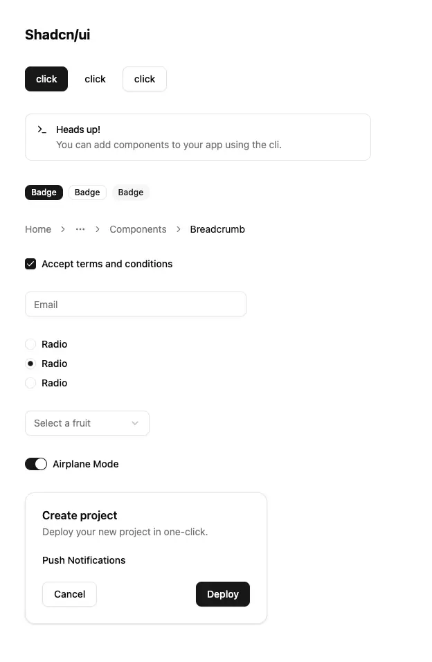
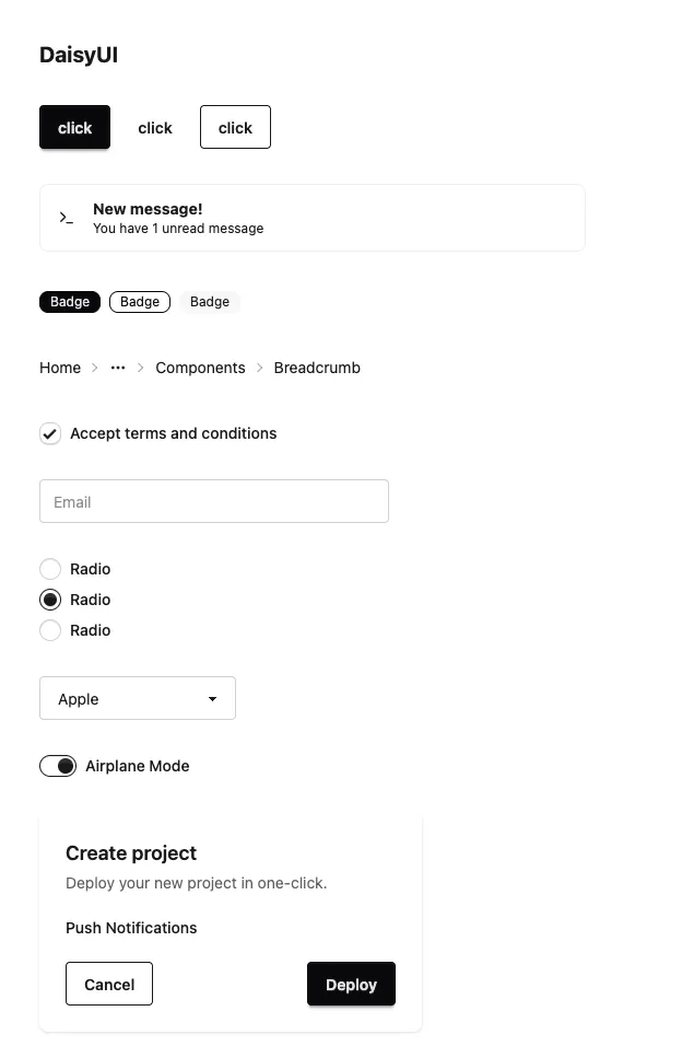
Here you can see the components from shadcn/ui next to the default DaisyUI theme, without any modifications:
Here you can see the components and the default light theme from Daisy UI, but modified to match shadcn/ui more closely:
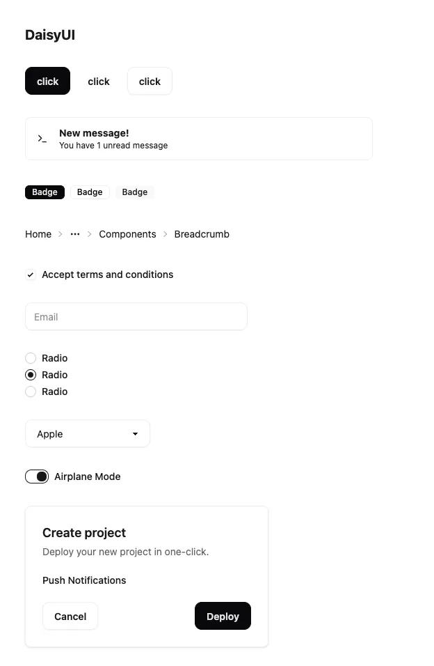
Now obviously, this is not a 1:1 match. The interactions (hovering, clicking) are also different. But I am pleasantly surprised, how little it took to roughly match each component. Usually it was a shadow-xs, less intense border (base-300 instead of neutral), a modified border radius and a font-medium.
Where’s Waldo?
Here are some emergent patterns, that I was able to identify:
- Components in daisy are usually larger by default. Even the ”*-sm” versions are too large to match the shadcn/ui default.
- Shadcn components have less depth than daisy with “depth” turned on. Daisy seems to use “shadow-sm”, where as shadcn uses “shadow-xs”
- Borders in shadcn are lighter than in daisy. Daisy styles “outlined” components with a very prominent border, where as in shadcn it is more subtle (gray).
- Shadcn seems to have more niche colors, such as
--color-ring - DaisyUI has additional colors called
neutralandbasein addition toprimary, andaccent. Shadcn hasmuted, which I think is similar to daisy’sbase.
Final Thoughts
I think most people will agree that shadcn/ui is doing amazing work. However, I think it is unfortunated that it is completely tied to React. There are ports being worked on for Solid, Svelte, Vue and more. There is even an awesome-shadcn-ui repository. However with all of these tools I do dread the dependence on JavaScript. I think more “pure” (in the sense of “purely css”) UI libraries (Bootstrap, Bulma, DaisyUI) do offer an advantage in terms of flexibility and portability. I understand the disadvantages and lost functionality, especially with Radix focus on accessiblity for screen readers, keyboard navigation, rtl support, etc. So by all means, keep using React and Shadcn/ui. You will most likely be fine. But for me personally I love to explore and build with many different technologies, so I cannot afford the same level of buy-in into certain technologies.
Another idea I would like to mention is that you might be able to wrap / convert the react components to web components with the @r2wc/react-to-web-component library. I have not tried it out myself and there are probably some caveats with the composition and nesting of components. Maybe LLMs are going to be good enough to try out these ideas with one quick prompt.
Also a shoutout to Franken UI. It is basically a react-free shadcn/ui style library with pure CSS and some JavaScript, which is optional. So check it out if you want a more polished react-free shadcn/ui experience!